Curiosities
Marketing and advertising are a very powerful tool and as much as we complain about seeing constant ads on TV, online, and on the streets, we still can appreciate a good marketing campaign when we see it. McDonald’s is so recognizable that you will inevitably think of it when you think of burgers, fries, and fast food in general. So you’d think they no longer need ads, but they keep coming up with creative ad campaigns all the time, and it’s probably what keeps them at the top of the fast-food industry. Let’s take a look at some of their most brilliant ads.
1. Bitten Off Billboards
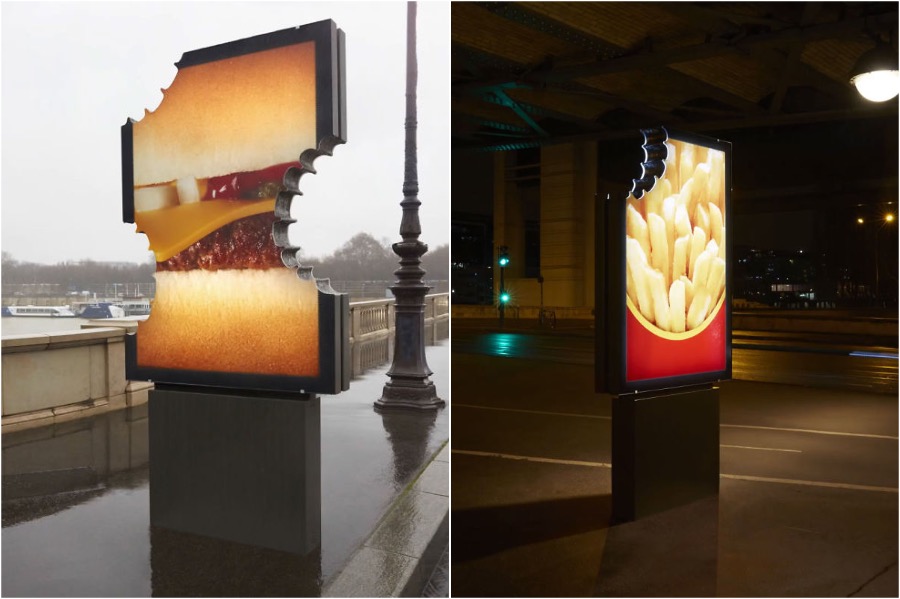
One of the most recent McDonald`s advertising is kind of genius. They placed a couple of billboards in Paris, but they definitely took a creative approach to billboards and their shape. They literally made them look like they were bitten off.

2. Signature Collection
Apart from the usuals cheeseburgers and Big Macs, McDonald’s likes to try out new flavor combinations in their burgers and they often do certain themed burger weeks to test out new products. You wouldn’t really associate McDonald’s with fancy theaters, and yet they’ve decided to advertise their signature collection. And you know what? It works.

3. Literary Approach
You have to give it to them, it’s a pretty freaking cool idea to create an ad of a burger made out of books designed for each ingredient. And the titles of those books also give you the idea that McDonald’s only uses the best of the ingredients.

4. Super Size Everything
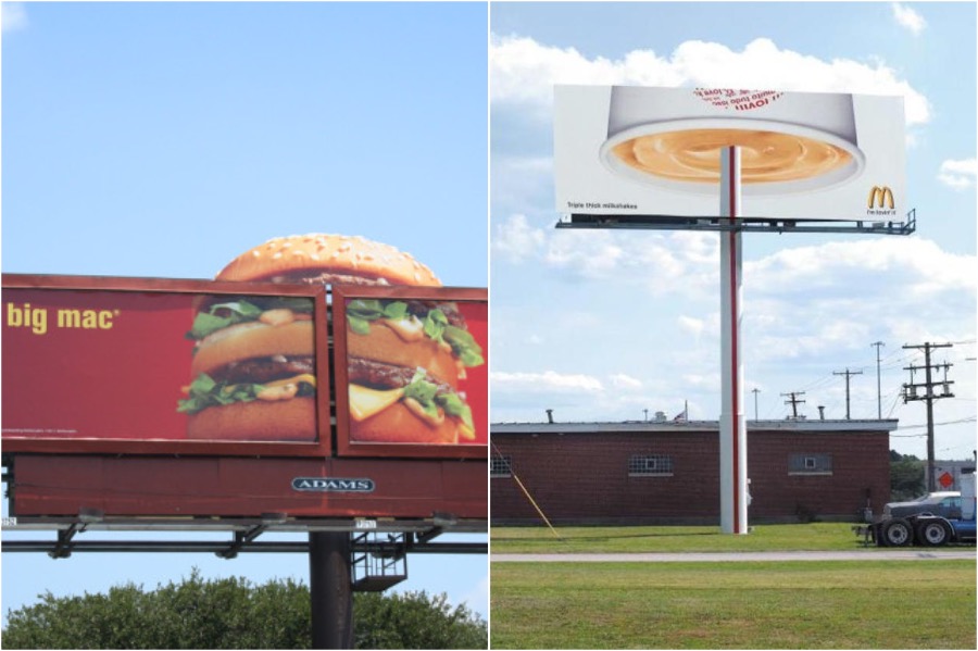
America is known for its massive portions, so it only makes sense to capitalize on their super-sized meals by using supersized billboards. You know that Big Mac is really big if it needs two billboards to depict it.

5. Blend Into The Environment
Another creative technique that McDonald’s has used in their ad campaigns is to make their ads part of the environment. Ads are literally blending into the fabric of day-to-day life with a crosswalk made of fries and a bus stop that uses reflection to their advantage.

6. A Cup Of Coffee
America is obsessed with coffee and so is the rest of the world. And when they make those coffee cups look so enticing it’s hard to say no to it on a cold and early morning.

7. Light At The End Of The Tunnel
McDonald’s has also taken a cool approach to using light in their ads. It’s almost like a light at the end of the tunnel, a tasty meal at the end of the day, a carton of fries shining in the sky similar to a Batman logo beacon.
8. Cute And Effective
This is a particularly good example of creativity. They combined cute and fluffy things that everyone loves, with a word that reminds you that you might be hungry. The result is adorable, eye-catching, and effective.

9. Convenience At Its Best
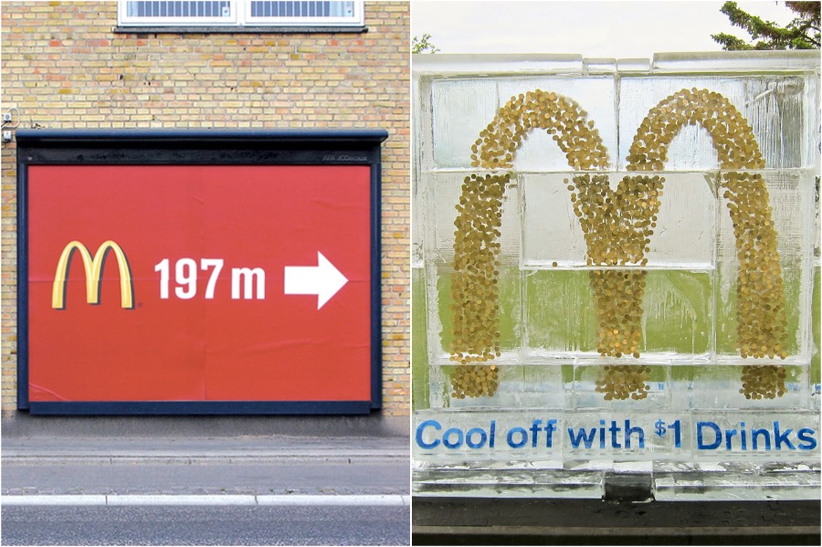
McDonald’s never fails to remind you that they’re open, nearby, and inexpensive, so it’s time for a snack or a meal. Their ads often reference their special offers, cheap prices, and the proximity of the nearest restaurant to the ad you’re seeing.

10. Taking Every Chance
And even when it’s not really the food you’re after, McDonald’s will lure you in with free wifi and while you’re there, you’re bound to grab a cheeky burger or at least a carton of fries to munch while you’re using their wifi.


